
DIAL - A - RAVE
Dial‑A‑Rave is a brand concept that rejects the polished, commercially driven direction of today’s dance music scene. Instead, it strips things back to their raw, underground roots — using minimal, textured visuals and a single phone number as the central touchpoint.
This approach echoes the DIY spirit of 90s rave culture, creating a sense of mystery and exclusivity. The result is a brand identity that feels authentic, anti‑corporate, and deeply connected to the rebellious energy of its audience.
Client
University FMP
Year
2023
Services
Branding
Print
Motion Graphics
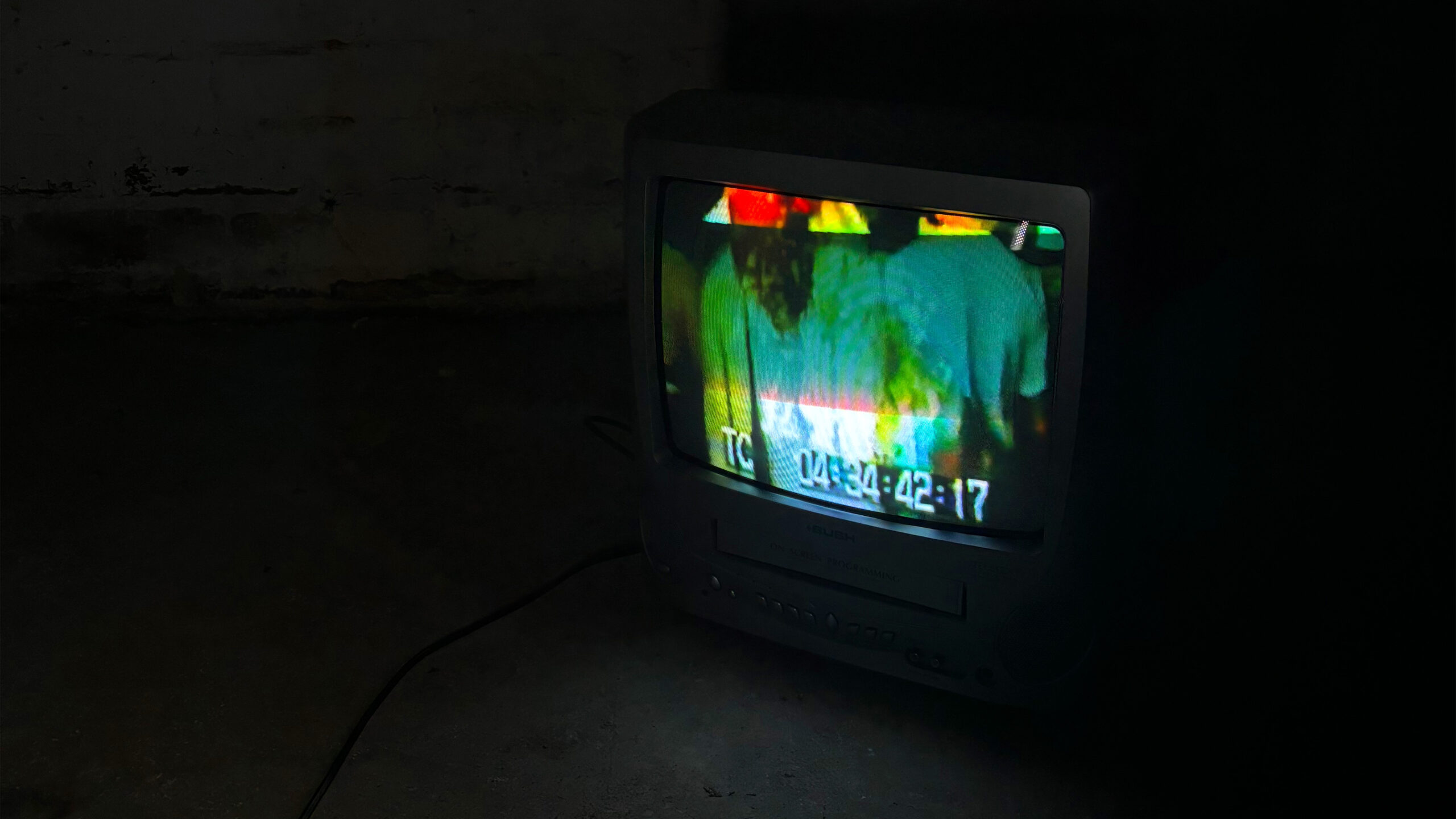
Diving Into the Research
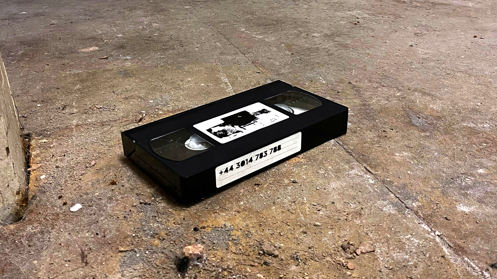
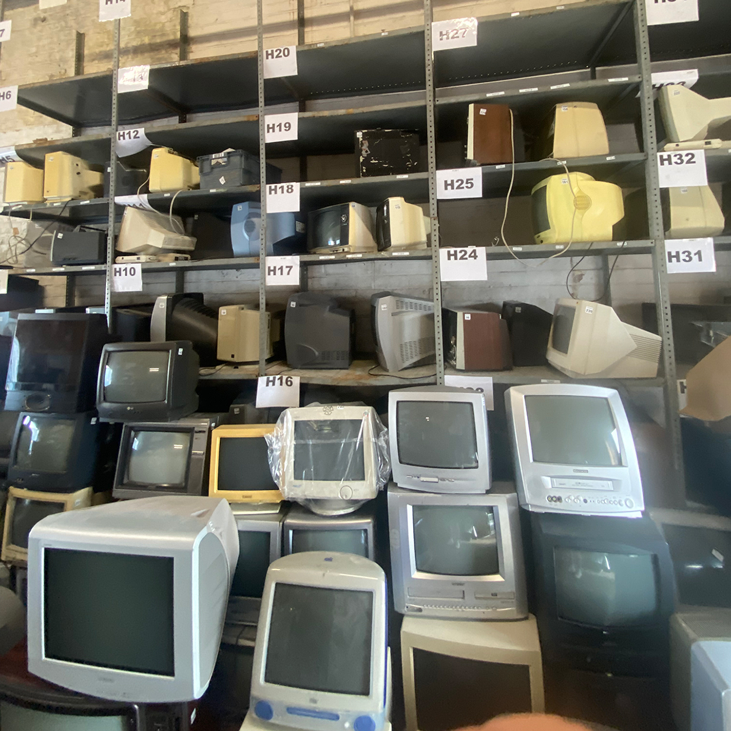
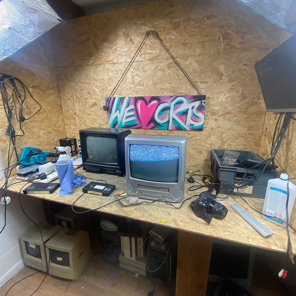
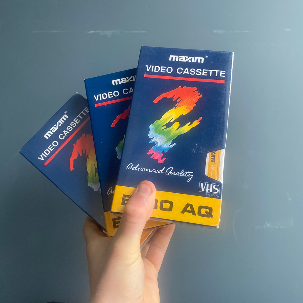
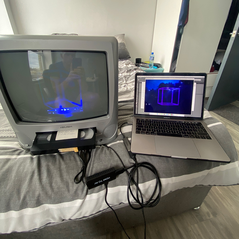
The research for this project started with an exploration of retro rave culture and the analogue technology that defined its aesthetic. I deep‑dived into the world of CRT monitors, VHS tapes and lo-fi visuals, spending time with a CRT enthusiast based in a scrapyard who taught me the ins and outs of this outdated tech.
This hands‑on process culminated in sourcing my own CRT setup, allowing me to record and playback visuals directly from my laptop. The result was a toolkit of authentic, textured footage that became the backbone of the project’s raw, underground aesthetic.
Creating Analogue Textures
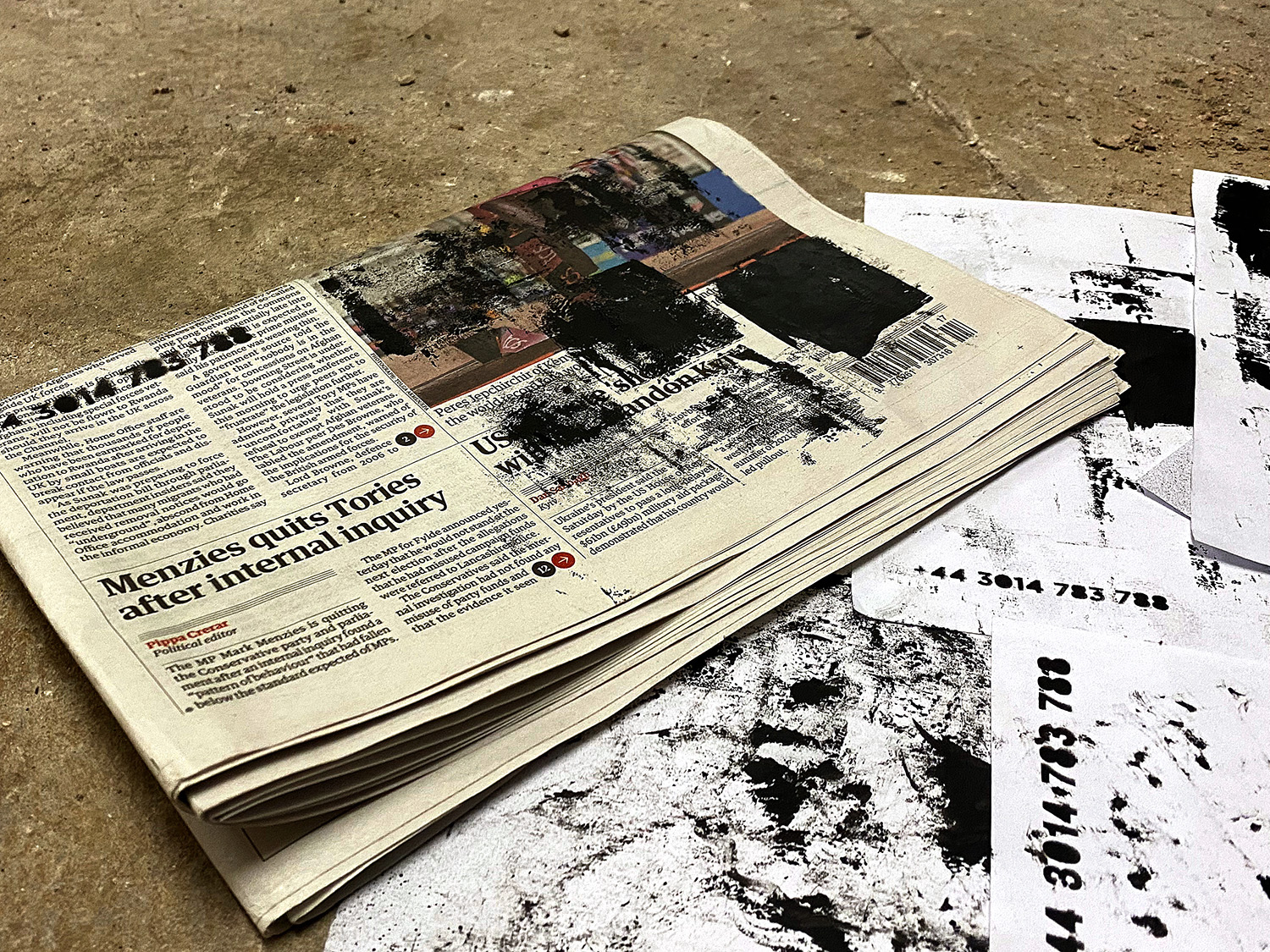
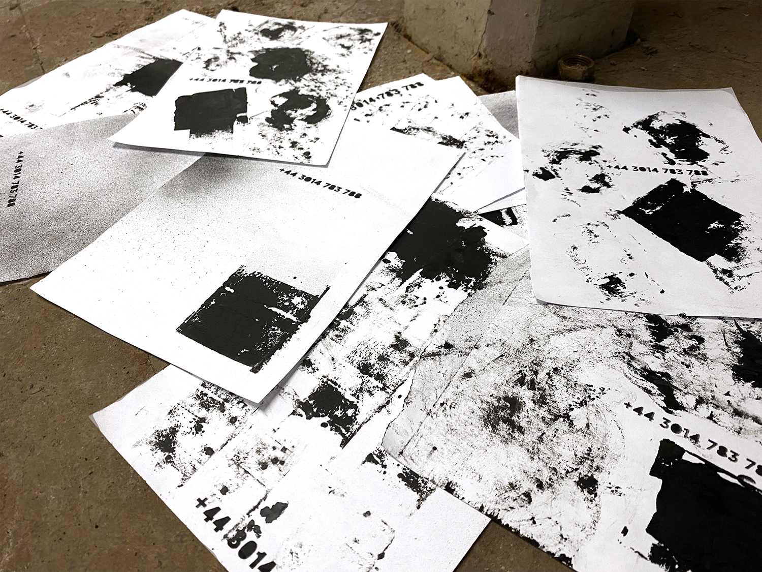
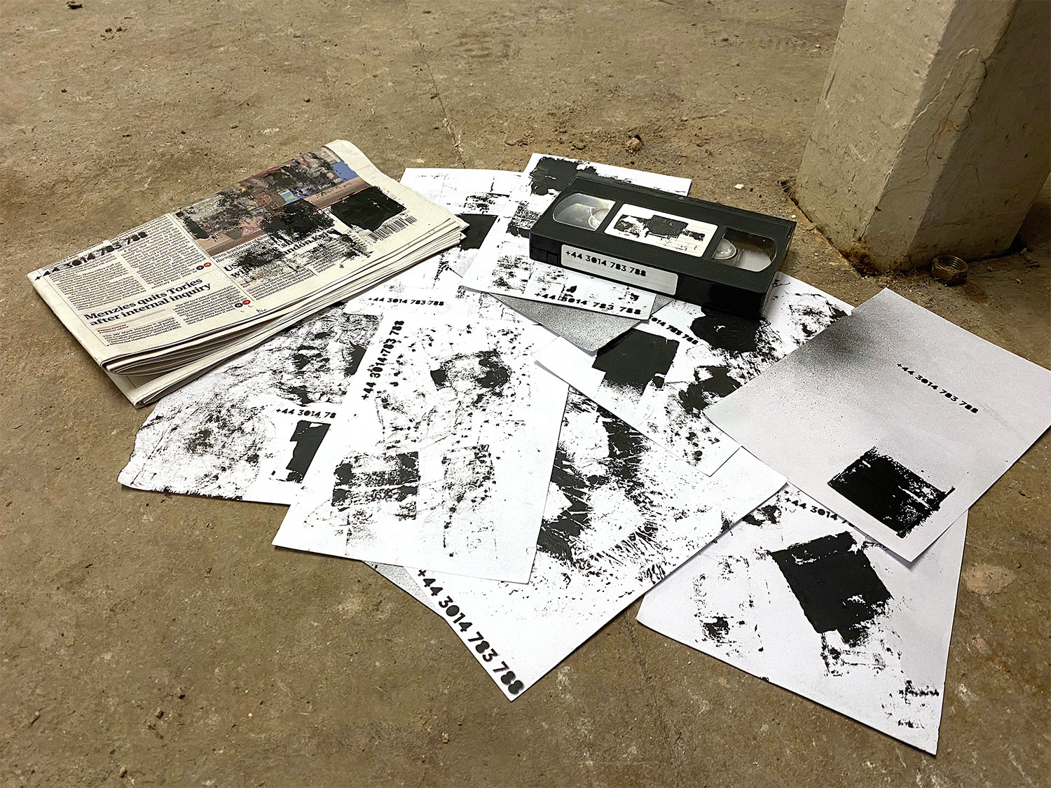
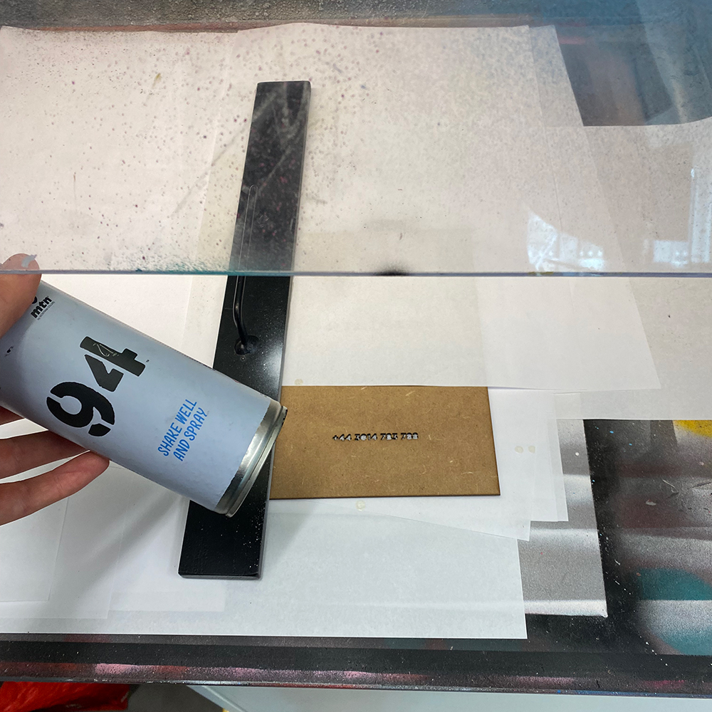
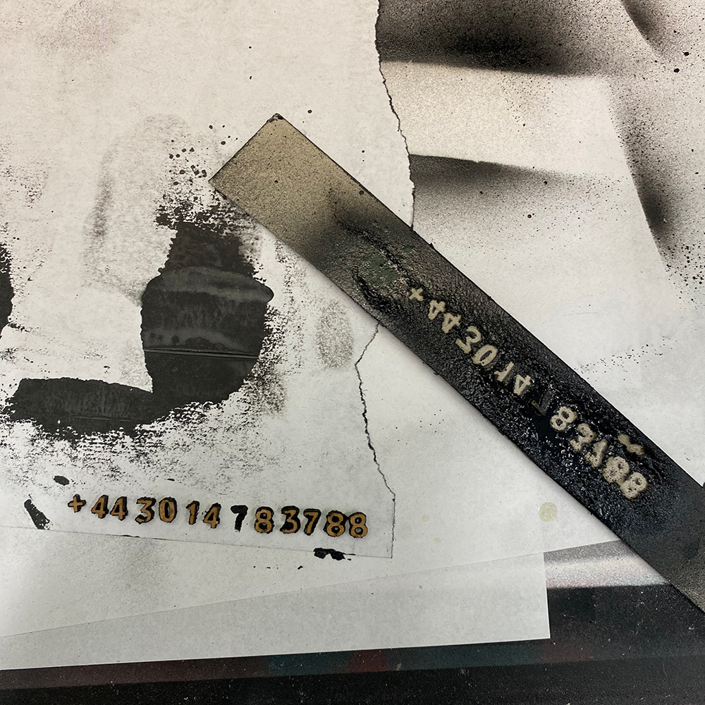
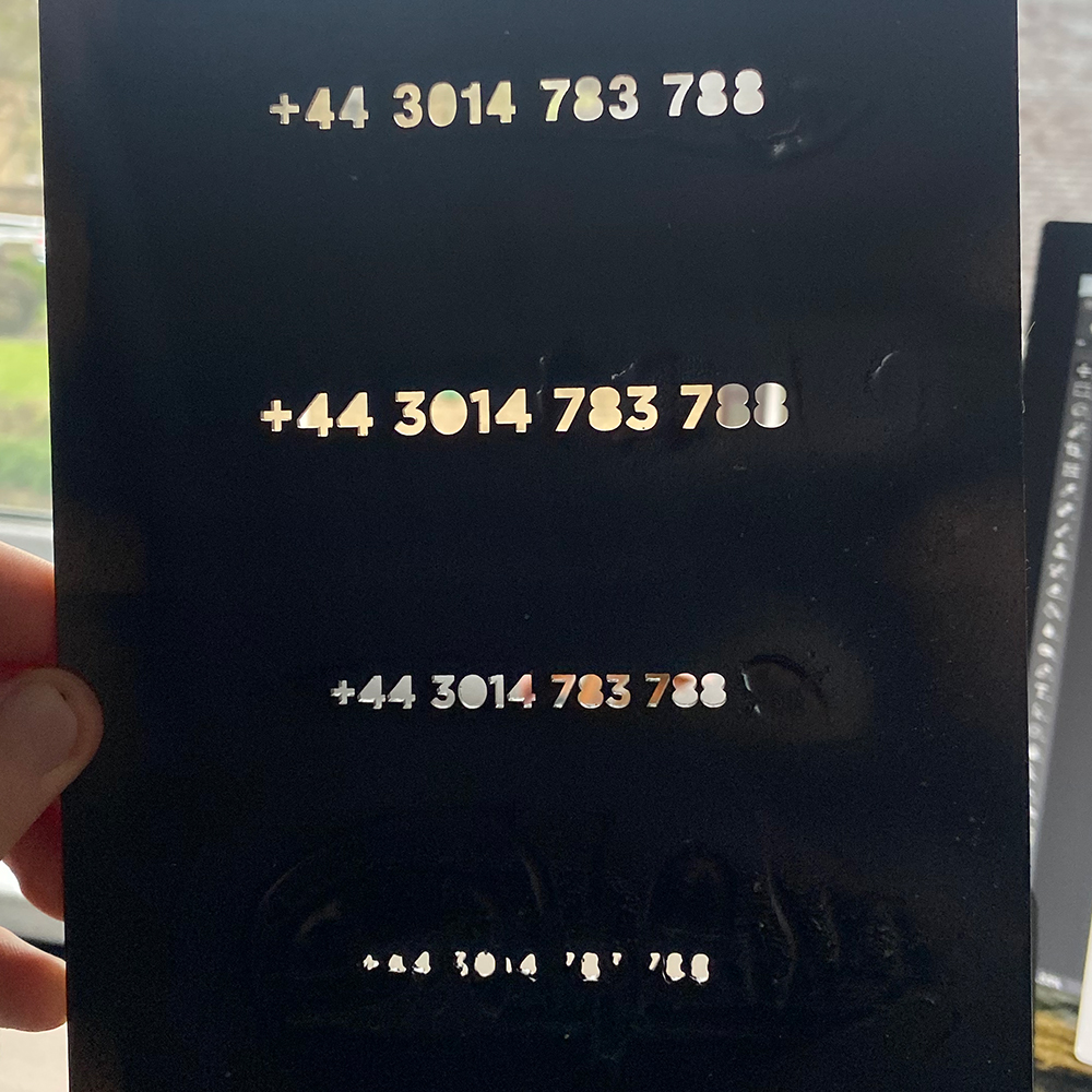
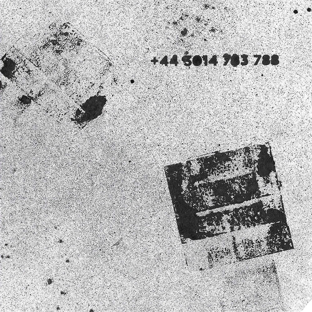
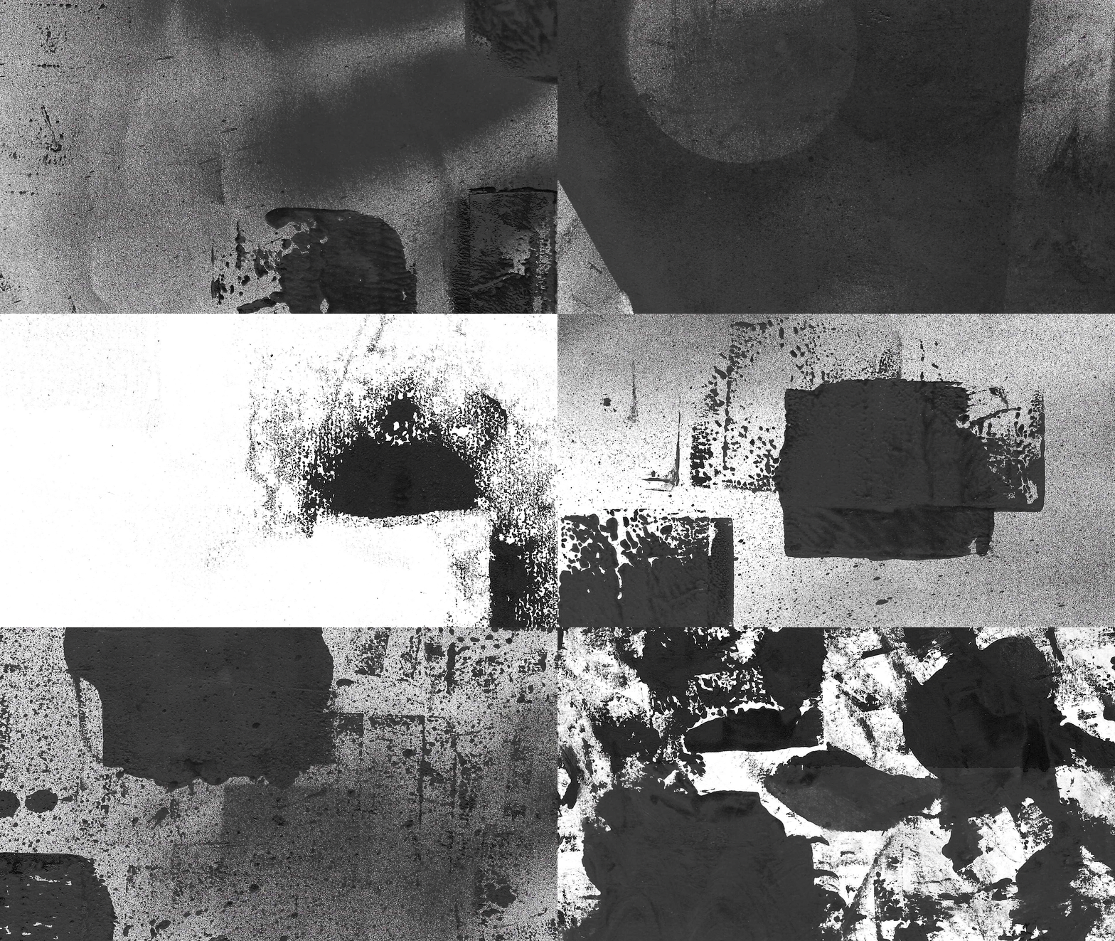
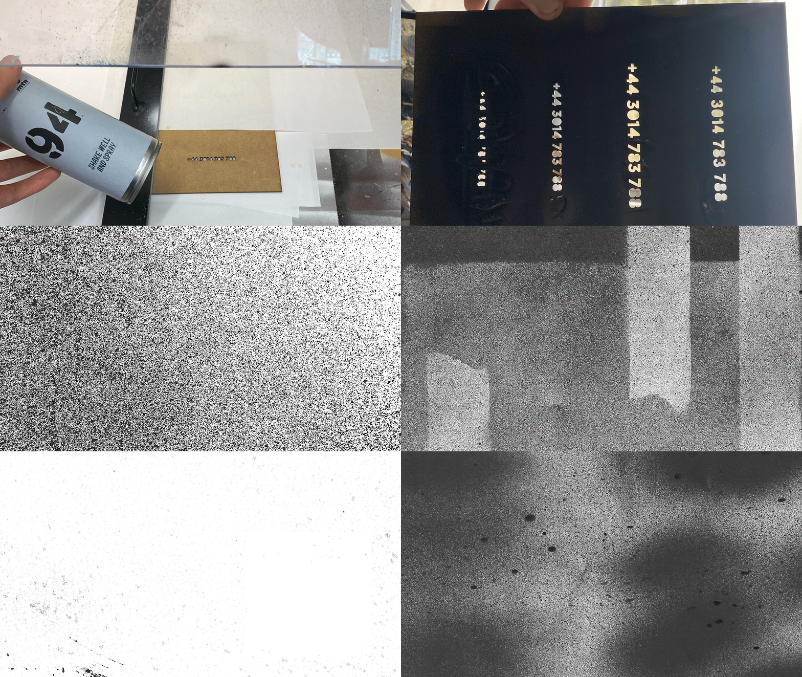
To capture the raw, DIY aesthetic of 90s rave culture, I created a series of posters entirely with analogue tools. Taking cues from original rave flyers of the era, I experimented with spray paint, stencils, and photocopy techniques to produce authentic, imperfect textures.
Through a process of trial and error, I developed over 200 background variations. These became a key recognisable point for the brand, replacing more traditional markers of identity that had been deliberately stripped away.
Expanding the brand
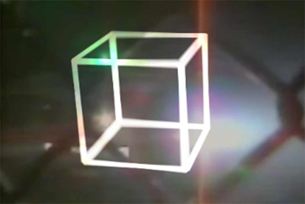
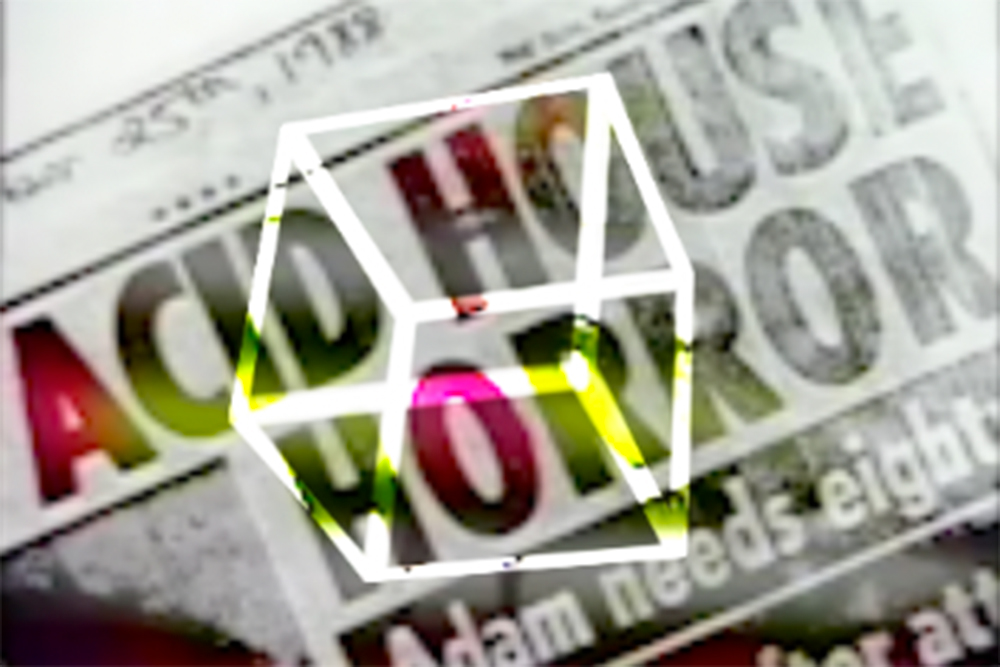
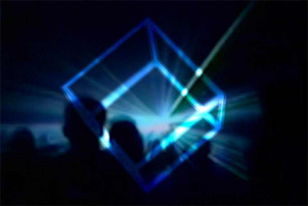
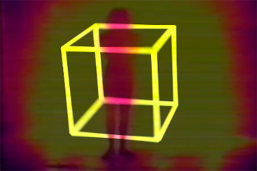
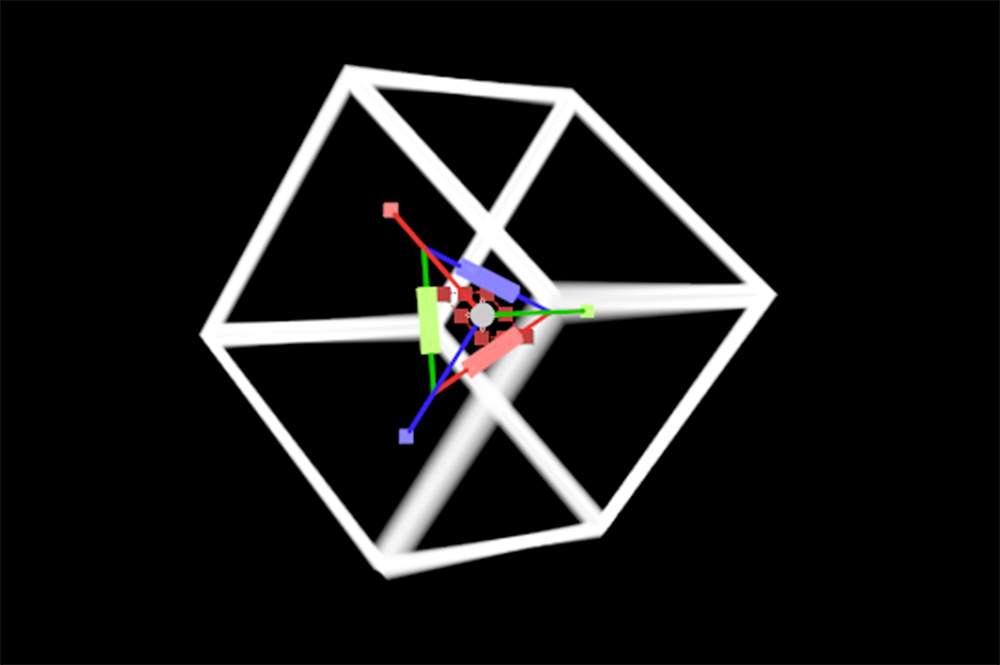
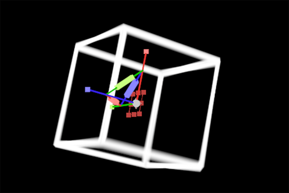
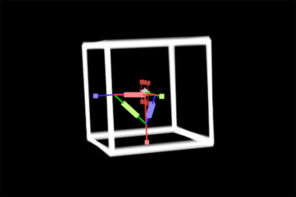
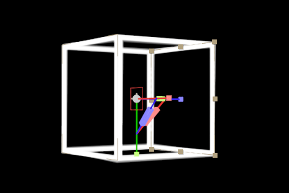
To test how the brand might translate into modern contexts, I experimented with combining retro rave footage and a 3D cube visual. This explored whether the stripped‑back identity could extend into digital content, a key factor for the visibility and success of contemporary music brands.
Ultimately, I decided not to use these experiments in the final output, as they began to dilute the raw, anti‑commercial message at the heart of the brand.
Building an underground presence
I repurposed archival rave footage to create adverts for the new events, layering in a textured cube at the centre to give the brand an identifiable visual anchor. The cube’s rough, analogue texture echoed the aesthetic of the poster series, tying the digital content back to the stripped‑back, anti‑commercial identity.
This approach allowed the brand to have just enough recognisable elements to cut through, while staying true to the raw, underground spirit of the original rave culture.
Mapping the user journey
I designed a user journey plan that charted the process from initial awareness to the final rave. Each stage retained the same analogue, stripped‑back aesthetic from textured posters to minimal SMS updates building intrigue while keeping the brand anti‑commercial at its core.
The only injection of bold colour came from the rave footage itself, ensuring the energy and vibrancy of the events contrasted with the stark, monochrome build‑up for maximum impact.
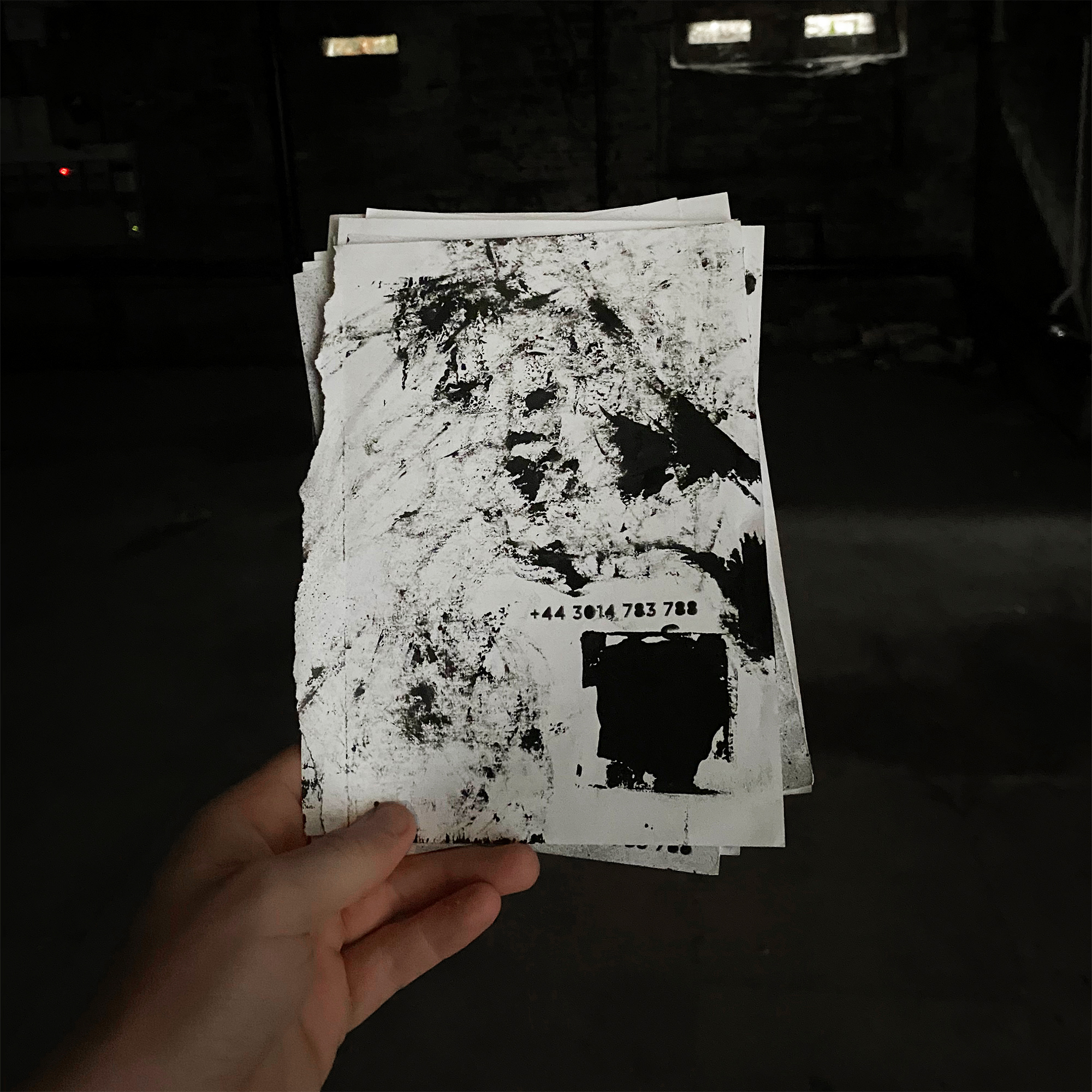
Stripped‑back, analogue posters placed in key locations to spark intrigue and direct people to a single phone number.
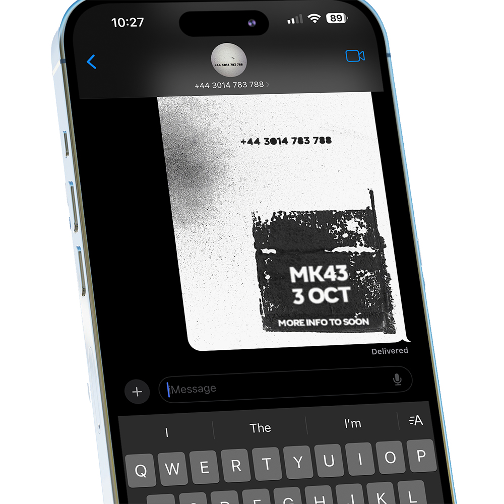
Minimal SMS updates maintain the underground feel, giving only essential information to build anticipation.
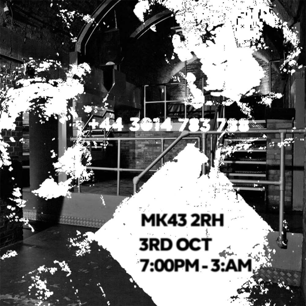
A final message reveals the time and location, keeping the process low‑key and true to the DIY rave culture.
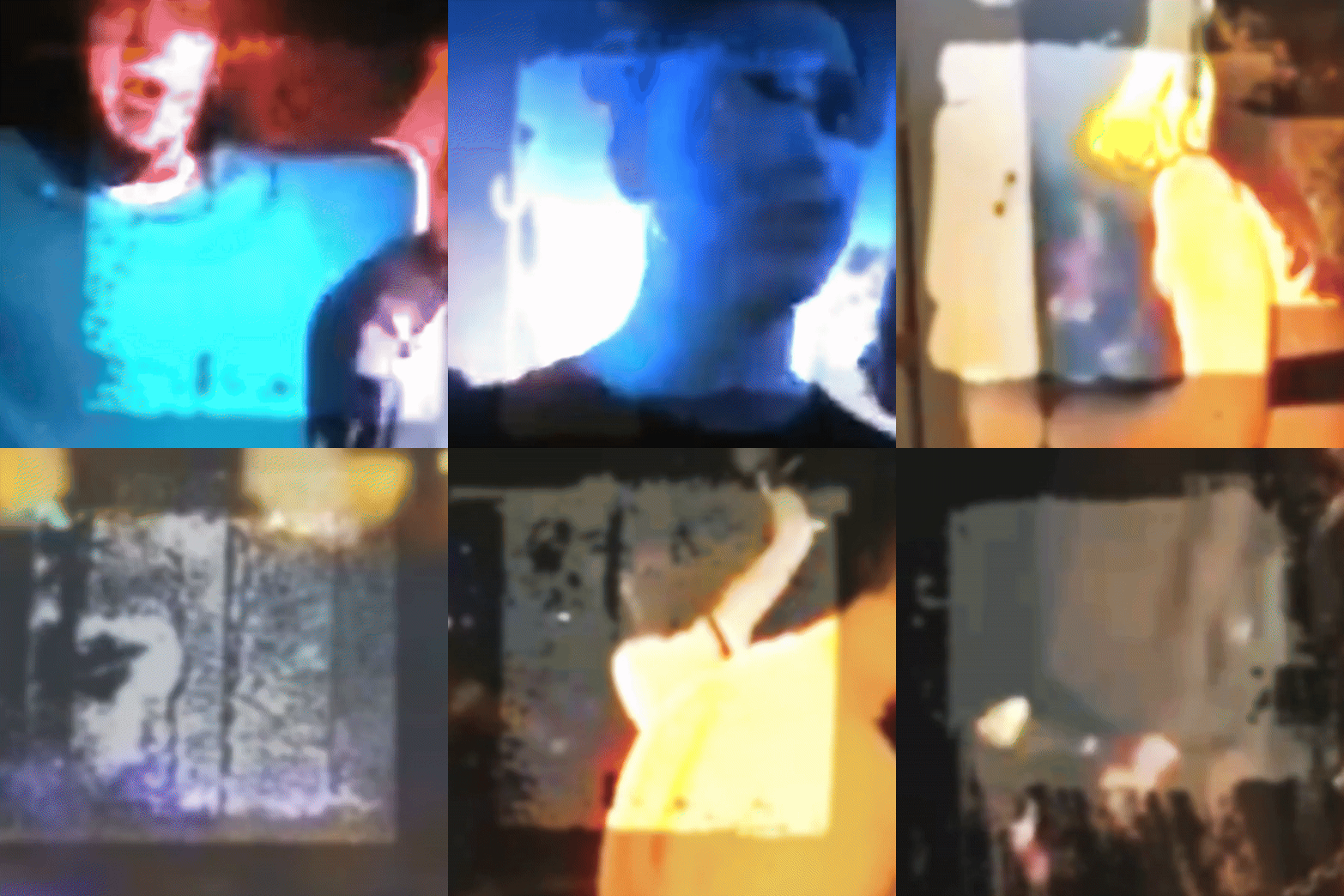
The build‑up gives way to raw, colourful footage from the event, delivering a high‑energy payoff to the monochrome lead‑up.