Speedtech
SpeedTech is a Uk based air cargo logistics specialist. While their technical offering is strong, their existing branding felt disjointed and visually outdated — particularly across their van livery, where a lack of consistency and clarity made it easy to miss what they actually do.
As part of my Brands on Vans series where I reimagine branding spotted on the road that could use a refresh. I developed a more cohesive, modern identity for SpeedTech. The updated design focuses on clean typography, high-impact visuals and a colour system that communicates reliability and precision. The result is a brand that looks as professional and efficient as the service they provide, whether seen on the road, online or in print.
Client
Speedtech (Mock Project)
Year
2024
Services
Branding Motion Graphics
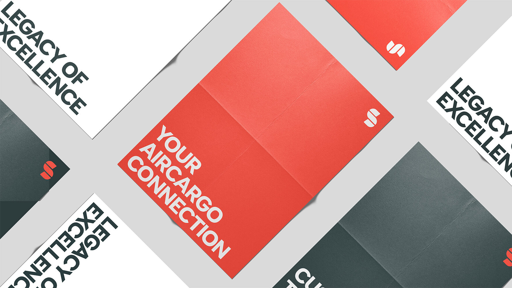
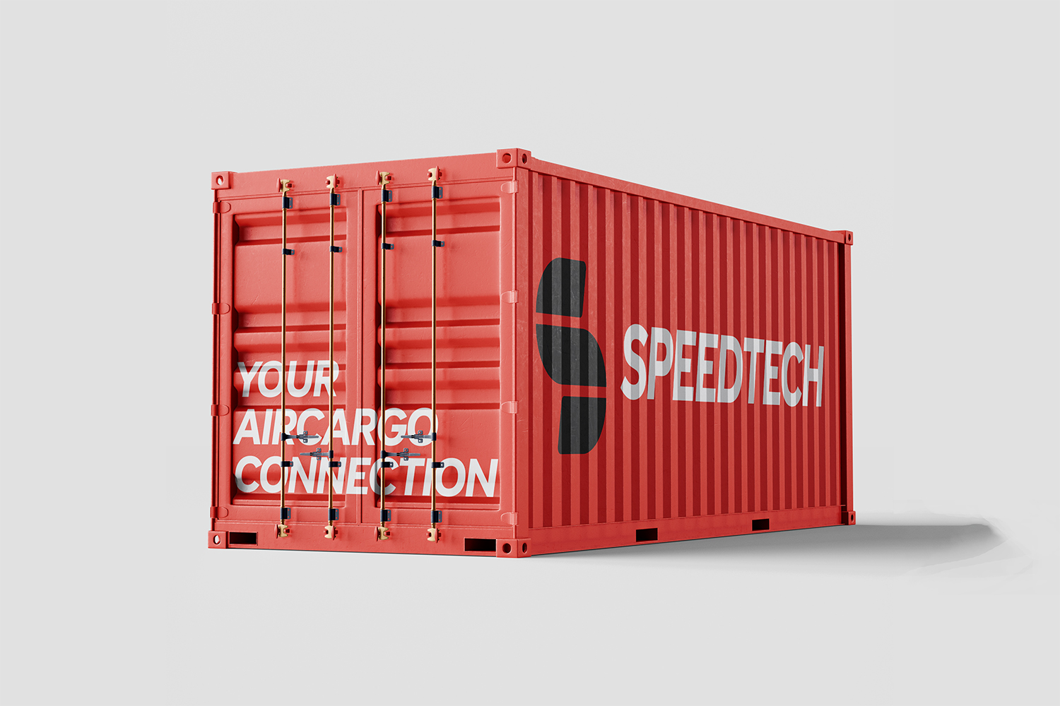

The Rebrand
The original van design felt cluttered and dated, the ribbon logo, busy text, and old-school fonts didn’t really do SpeedTech justice. The layout lacked structure, with no clear visual hierarchy, and the branding felt more like an afterthought than a deliberate design. It didn’t communicate the speed, reliability, or scale of the service, and was easy to overlook on the road.
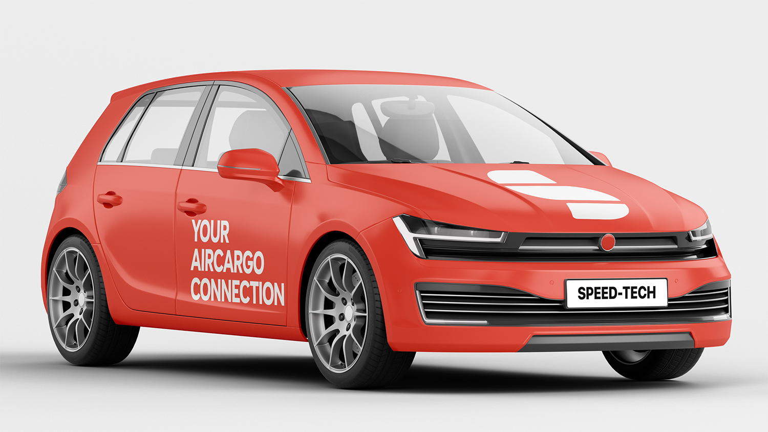
The redesign simplifies everything. Bold, modern type, a sharp new “S” mark, and clear messaging make the brand feel way more confident and professional. It’s now something you’d notice on the road – clean, direct, and easy to remember.
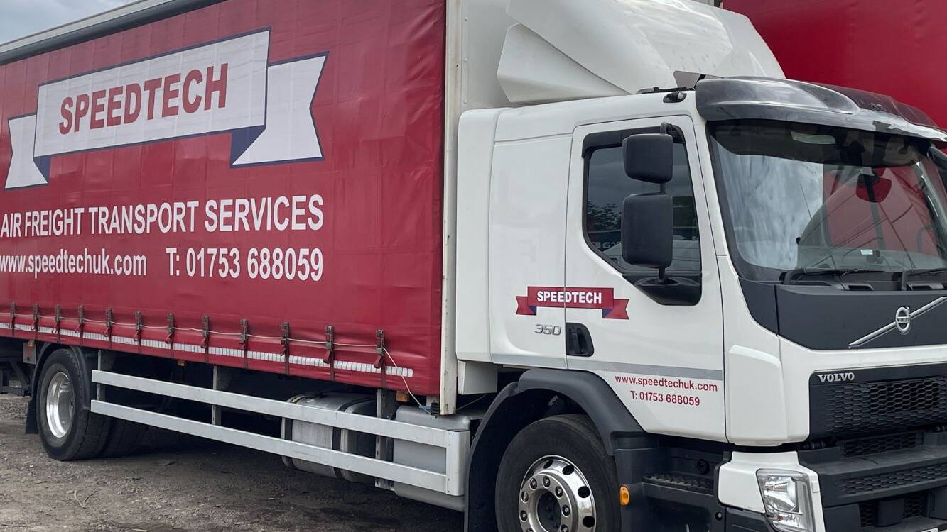
Before
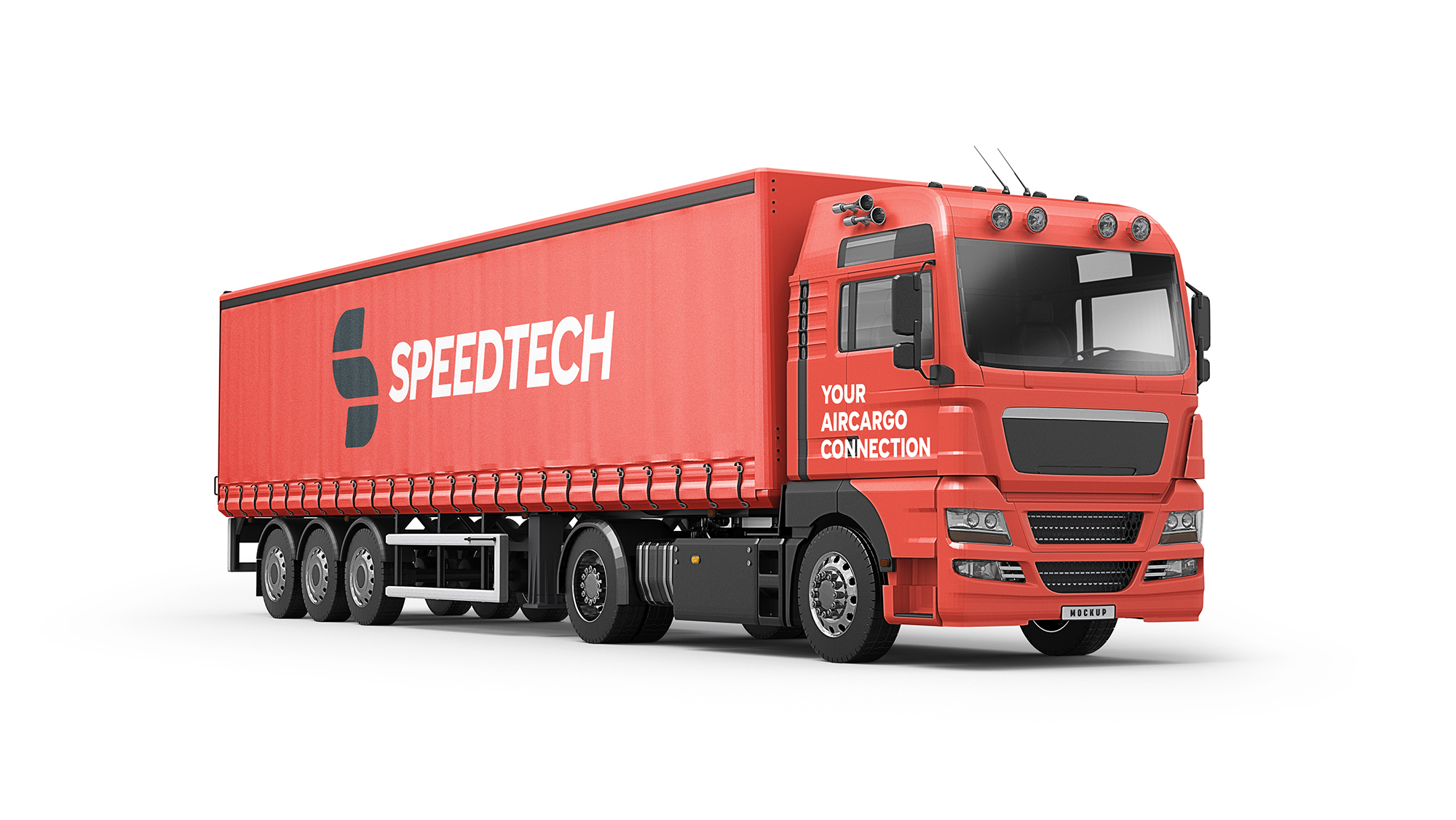
After
Developing the Logo Mark
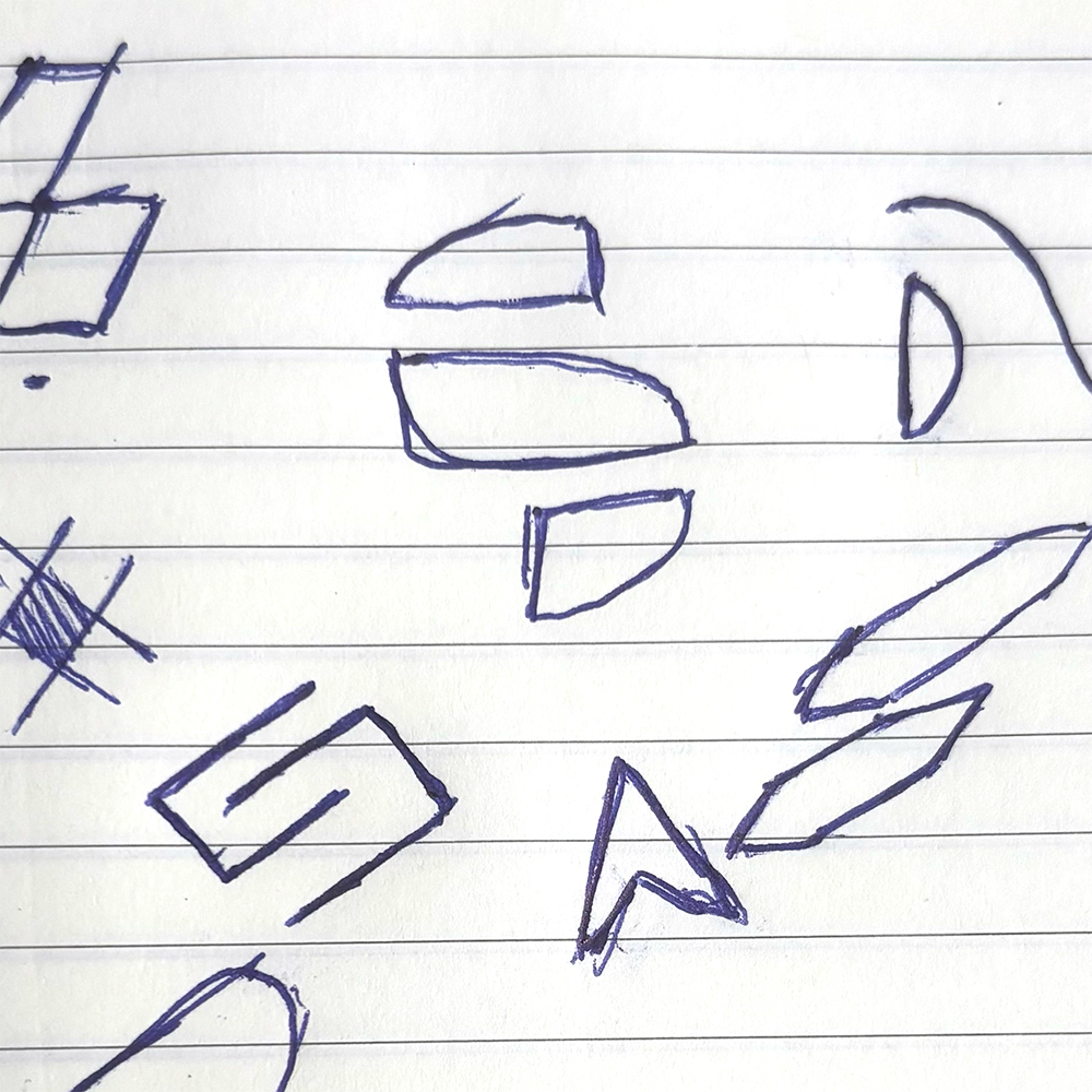
The mark began with a page of loose sketches exploring abstract “S” shapes and motion-inspired forms. A few of those early ideas (top centre and middle right) played with slicing and rotation – ideas that helped form the final symbol.
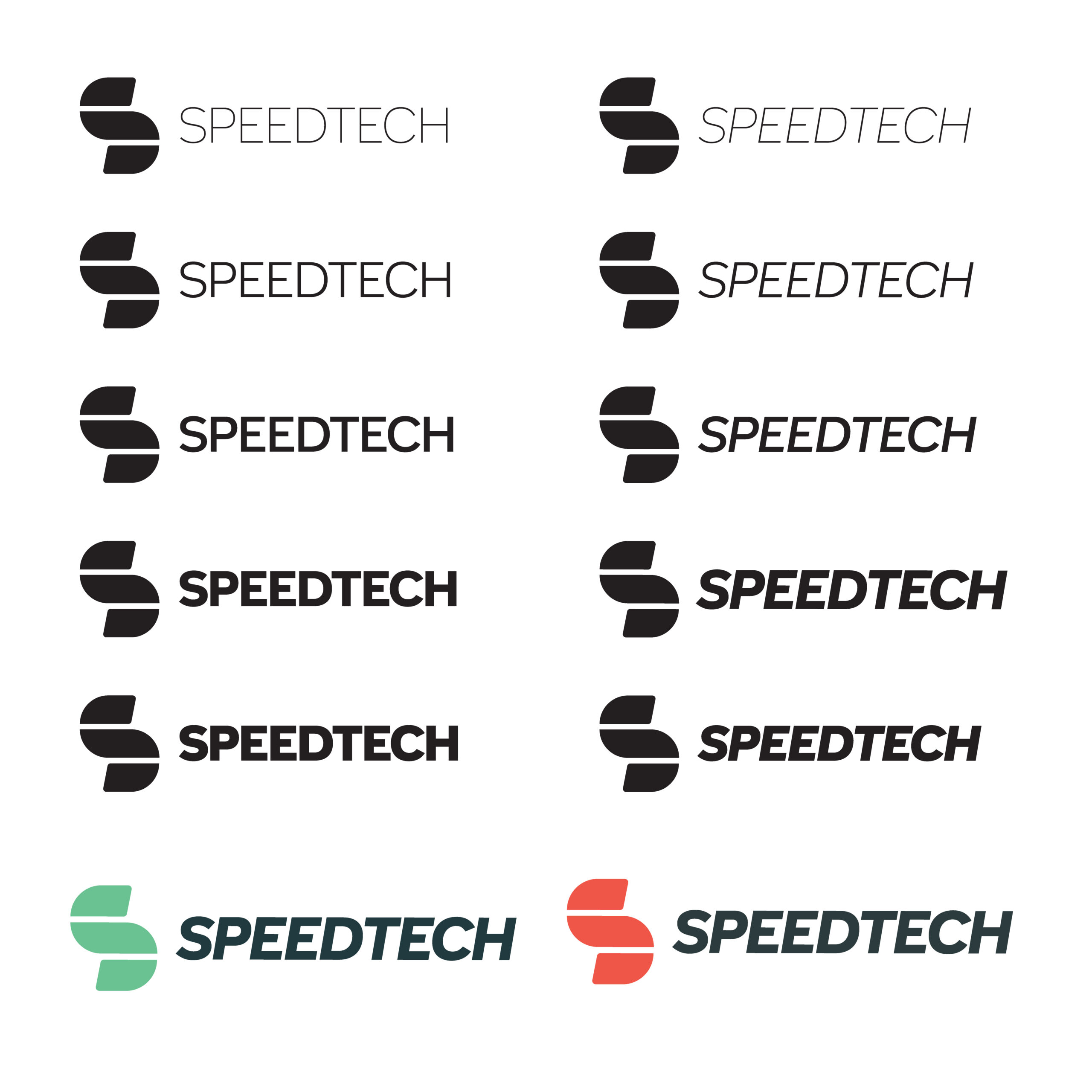
From there, the design was refined digitally, focusing on balance, simplicity and recognizability at all sizes. The result is a bold, geometric “S” that feels fast, modern, and solid – a perfect fit for a transport brand.

Expanding the brand
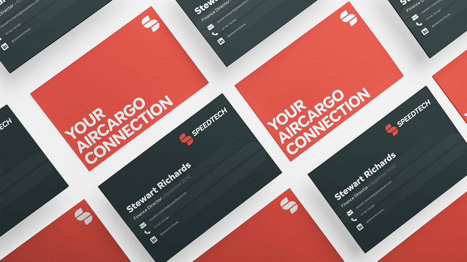
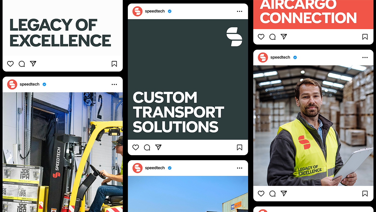
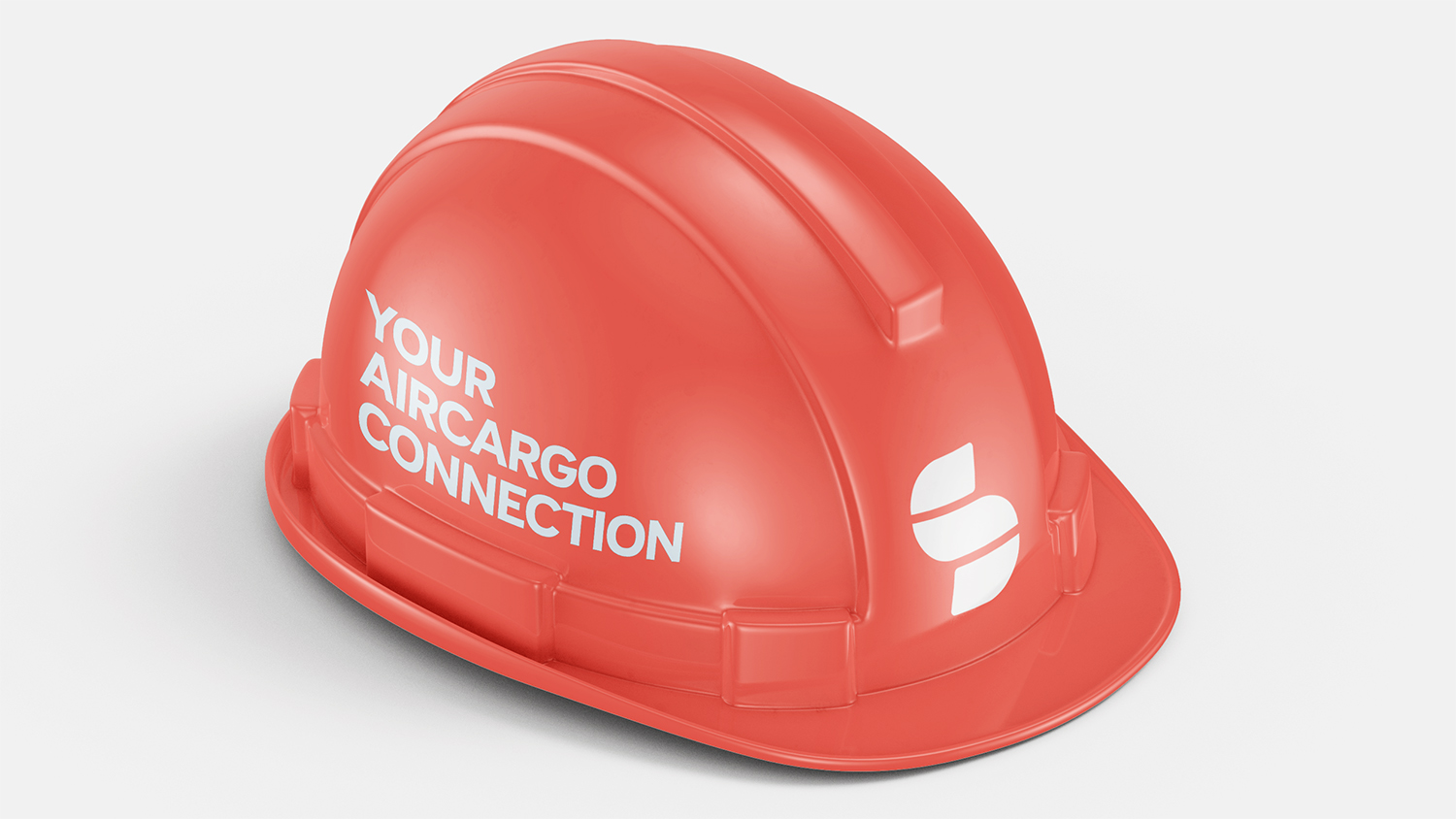
With the core identity in place, the next step was to extend the branding across key touch points – from vehicle graphics and business cards to safety equipment and digital assets. Every element was designed with consistency in mind, using a bold colour palette, strong typographic hierarchy, and a clear layout system that ties everything back to the central brand.
The result is a flexible and scalable visual identity that holds up across both print and digital. Whether it’s a social media post, a hard hat, or the side of a delivery vehicle, the brand remains instantly recognizable, professional, and visually cohesive – helping SpeedTech present a unified message wherever it appears.